
Mastering Color Theory in Decor: Transform Your Space with the Perfect Palette
Color is a powerful tool in interior design, capable of evoking emotions, influencing moods, and transforming spaces. Understanding the foundations of color theory in decor can empower you to create harmonized environments that not only look good but also feel good. In this article, we'll explore the basics of color theory, delve into the intricacies of the color wheel, and offer practical tips for choosing the right color palette for your home. Whether you're redesigning your living room or refreshing your bedroom, mastery of color theory can take your decor to the next level.
Shop the Latest Home Decor Here!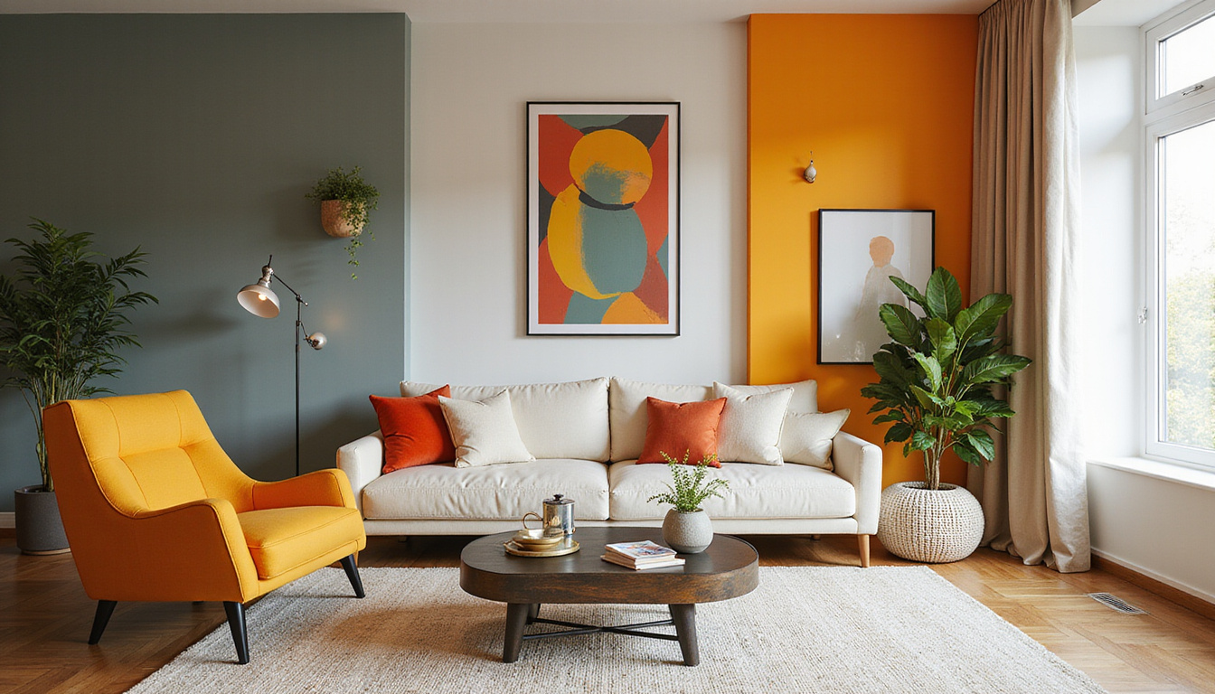
Key Takeaways
- Color theory is the foundation for creating harmonious and aesthetically pleasing decor.
- Understanding the color wheel helps in identifying primary, secondary, and tertiary colors for effective combinations.
- Different colors evoke specific psychological responses that can influence mood and ambiance in a space.
- Choosing a suitable color palette involves considering the function and feel of each room in your home.
- Implementing color theory practically requires thoughtful selection of complementary, analogous, and triadic color schemes.
Understanding the Basics of Color Theory
Color theory in decor is a foundational principle that informs how we choose and combine colors in our spaces. Understanding the basics of this theory can significantly enhance the aesthetics and ambiance of any room in your home. At its core, color theory involves the study of how colors interact, the emotions they evoke, and the visual impact they create. For instance, warm colors like reds and yellows can energize a space, making it feel vibrant and lively, while cool colors, such as blues and greens, often promote calmness and relaxation. Additionally, the color wheel serves as a vital tool in color theory; it helps decorators identify complementary colors (colors opposite each other on the wheel), analogous colors (colors next to each other), and triadic schemes (three evenly spaced colors). When applied thoughtfully, color theory in decor can transform ordinary spaces into beautifully harmonious environments, making it essential for anyone looking to refresh their home or office.
The Color Wheel: Primary, Secondary, and Tertiary Colors
Understanding color theory in decor is essential for anyone looking to create aesthetically pleasing spaces. The color wheel serves as a fundamental tool, consisting of primary, secondary, and tertiary colors. Primary colors—red, blue, and yellow—are the building blocks of all other colors and cannot be created by mixing other colors. When two primary colors are combined, they form secondary colors: green, orange, and purple. These secondary colors enhance the vibrancy of any decor scheme. Tertiary colors, which result from mixing primary and secondary colors, offer even more depth and variation, including hues like red-orange and blue-green. By mastering the relationships between these colors, decorators can effectively apply color theory in decor to evoke emotions, create harmony, and establish a cohesive theme throughout any space, ensuring that your home reflects your personal style vibrantly and invitingly.
'Color is the keyboard, the eyes are the harmonies, the soul is the piano with many strings.' – Wassily Kandinsky
The Psychological Effects of Colors in Interior Design
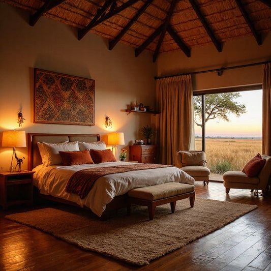
Color theory in decor plays a crucial role in shaping the psychological atmosphere of a space. Different colors can evoke varied emotional responses, making it essential for homeowners and designers to understand how these hues can influence mood and behavior. For example, cool colors like blue and green are often associated with calmness and tranquility, making them ideal for bedrooms or relaxation spaces. Conversely, warm colors such as red and orange can energize a room, encouraging conversation and activity, which is why they are commonly used in dining areas or social hubs. By applying principles of color theory in decor, one can create environments that promote well-being and harmony, ensuring that each space serves its intended purpose effectively while catering to the emotional needs of its occupants. This understanding not only enhances aesthetic appeal but also contributes positively to the overall experience within a space.
Shop the Latest Home Decor Here!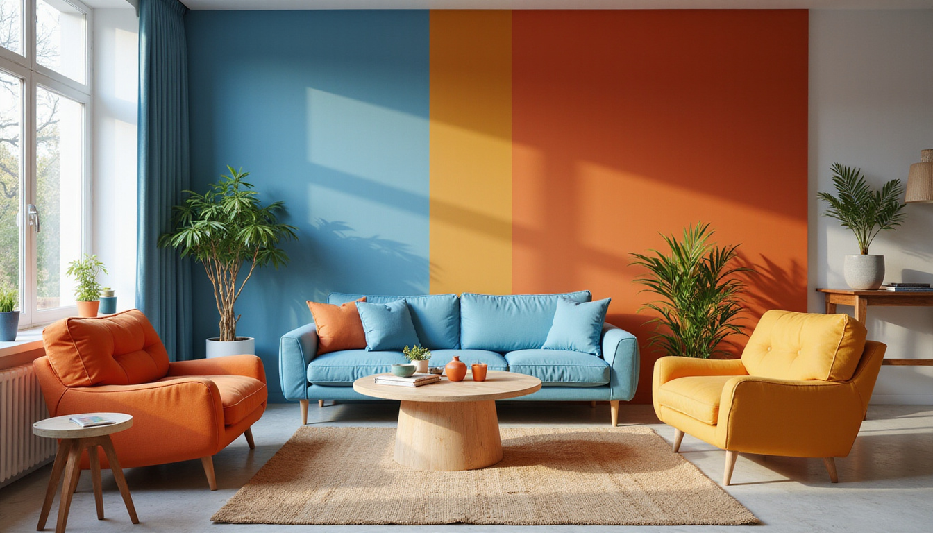
Choosing the Right Color Palette for Your Space
Choosing the right color palette for your space is a crucial aspect of interior design that can significantly impact the mood and functionality of any room. Understanding color theory in decor provides a solid foundation for making informed choices about shades that harmonize well together. Color theory explains the relationships between colors and how they can be combined to create a cohesive look. For instance, complementary colors, which sit opposite each other on the color wheel, can energize a space, while analogous colors, which are next to each other, tend to create a serene and harmonious atmosphere. When selecting your color palette, consider the purpose of the room: warmer hues can stimulate and energize, making them ideal for social spaces, whereas cooler tones promote calmness, perfect for bedrooms or relaxation areas. By applying the principles of color theory in decor, you can design an inviting space that not only looks beautiful but also feels right for your lifestyle.
Color Combinations: Complementary, Analogous, and Triadic Schemes
Color theory in decor is a fundamental aspect of interior design that can dramatically influence the atmosphere and aesthetic of a space. By understanding various color combinations—such as complementary, analogous, and triadic schemes—designers can create visually striking environments that evoke desired emotions and reactions. Complementary color schemes involve pairing colors that are opposite each other on the color wheel, such as blue and orange, to create a vibrant contrast that draws the eye. Analogous schemes, on the other hand, utilize colors that are next to each other on the wheel, like blue, blue-green, and green, offering a more harmonious and cohesive look that can induce calmness in a room. Lastly, triadic schemes incorporate three colors equidistant from each other on the color wheel; for instance, red, blue, and yellow can bring dynamism and energy to a space. By applying these color theory principles in decor, homeowners and designers can craft spaces that are not only aesthetically pleasing but also resonate emotionally with their users.
Frequently Asked Questions
What is color theory in decor?
Color theory in decor refers to the principles and guidelines used to effectively use color in interior design. It helps you understand how different colors interact with each other and how they can evoke specific feelings, creating a harmonious and aesthetically pleasing environment.
How do I choose the right color palette for my space?
To choose the right color palette for your space, consider the elements you want to highlight, the mood you want to create, and the existing furnishings. Start by using the color wheel to identify complementary, analogous, or triadic color schemes that work well together.
What are the psychological effects of colors in interior design?
Different colors can evoke various emotions and reactions. For example, blues and greens typically create a calming atmosphere, while reds and yellows can energize a space. Understanding these psychological effects can help you select colors that align with your desired ambiance.
Can you explain complementary, analogous, and triadic color schemes?
Complementary color schemes use colors that are opposite each other on the color wheel, creating high contrast. Analogous schemes involve colors that are next to each other, providing a harmonious look. Triadic schemes utilize three colors that are evenly spaced on the wheel, resulting in a vibrant and balanced palette.
What practical tips can I use to implement color theory in my home?
Start small by experimenting with paint swatches or accessories to see how colors interact in your space. Consider using a neutral base with pops of color through decor items. Additionally, make use of lighting to see how colors change throughout the day, helping you make informed decisions.